How To Pick The Right Colors For Your Wardrobe: Easy Color Analysis
First Published: July 2021
UPDATED: April 2023
Post Summary: When I first published this post in 2021, I had a professional color analysis done. At that time, I kept my hair highlighted to a light blonde. Jen, from Your Color Style, determined I was a Bright, Cool & Light color category in the Summer color season. The color palette in that category includes cool-toned colors in a medium hue. I have blue/gray eyes and cool toned skin. Now, it is 2023 and I am no longer highlighting my hair but is now my medium ash blonde color. The medium hue colors I was wearing before from my previous color analysis are now too bright for my coloring. I have discovered a FREE color analysis tool that is easy to use and you can quickly determine your color season. And did I mention it is FREE?! I used the Colorwise.me website to upload a photo of myself, select my skin, hair and eye color and it determines your color season!
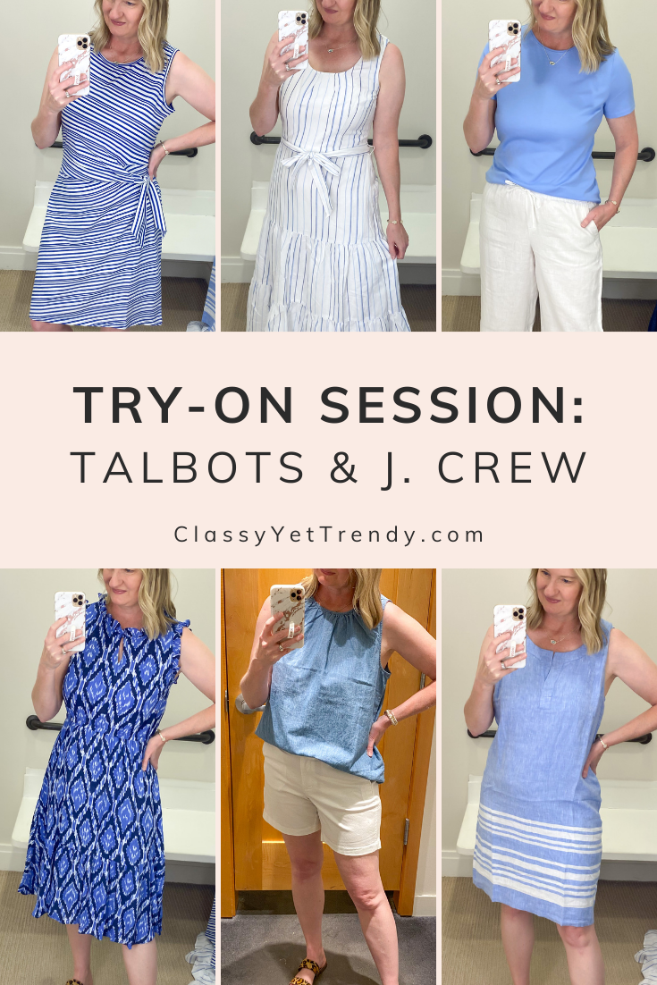
In June, when my husband and I went to Nashville, Tennessee for our 10 year anniversary (in this blog post), one of those days I wanted to go to Green Hills Mall. As we were walking by Talbots, the mannequins in the display windows were all dressed in gorgeous blue colors and they definitely caught my eye! When I went inside the store there was their clothes from the Summer line on a few mannequins. There were a couple of dresses I wanted to try on and a blue tee. When I put them on, I had an “AH HA!” moment…that color of blue looked great my eyes, my skin tone and my hair color. The color looked so flattering on me. I bought one of the blue dresses and I bought the blue tee!
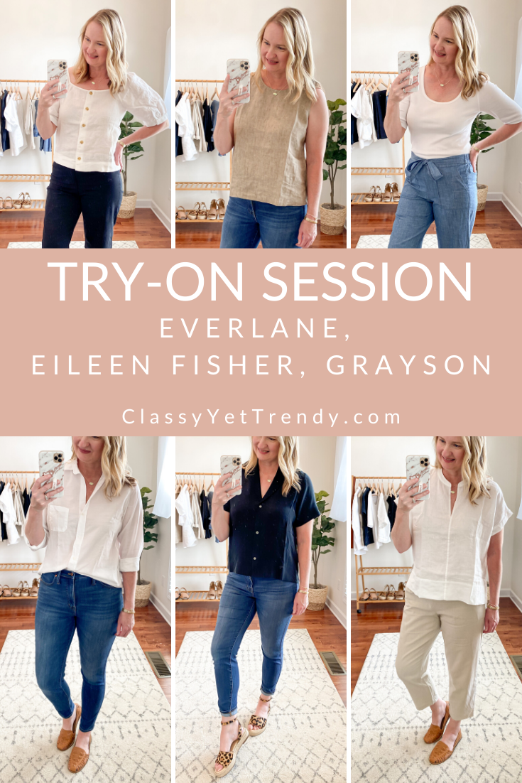
Here is the blog post, “Our Nashville Anniversary Vacation & Talbots and J. Crew Try-On Session Reviews” where I’m wearing all those gorgeous blue colors (the blue tee and blue dress I talked about above is in the upper right corner and lower left corner of the collage below)…
UPDATED 2023 COLORWISE Color Analysis
It is now 2023 and I am no longer highlighting my hair but is now my medium ash blonde color. The medium hue colors I was wearing before from my previous color analysis are now too bright for my coloring. I have discovered a FREE color analysis tool that is easy to use and you can quickly determine your color season. And did I mention it is FREE?! I used the Colorwise.me website to upload a photo of myself, select my skin, hair and eye color and it determines your color season!
“Your Color Style” Color Analysis in 2021
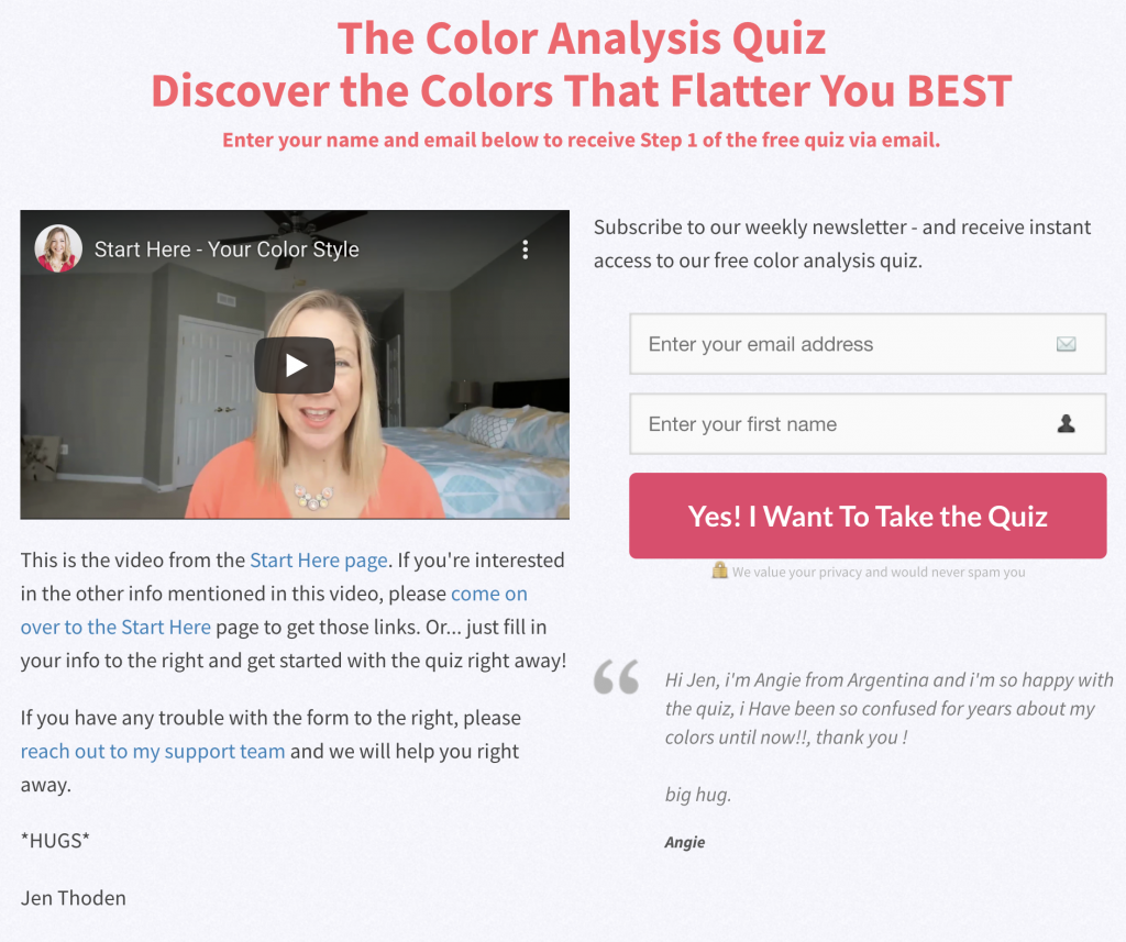
Choice #1 – Color Analysis Quiz
I did the Color Analysis Quiz first, which is super easy and IT’S FREE! Within minutes, I found out what color category I am (read on to find out the results of my Professional Color Analysis). There is just 3 steps to find out what color category you are and what colors look best on you…
Step 1 – Hair and eyes: This will determine if you are “Bright” or “Soft”
Step 2- Warm or Cool: This will determine if you are “Cool” or “Warm”
Step 3- Light, Medium or Deep: This will determine what your category is and what tones of the color wheel will be most flattering for you.
When you have completed your quiz, it shows your color category color palette, there is a video of Jen explaining your color category and you can also order your Color Fan and Color Guide eBook (optional, but the Color Fan is worth it)!
Choice #2 – DIY Color Style Kit
The DIY Color Style Kit is a color analysis that is budget-priced! It is a do-it-yourself kit, so you get all the tools you need to do a color analysis and it costs only $67!

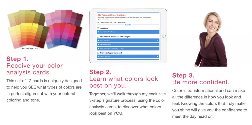
With the DIY Color Style Kit, you will receive 12 color cards (I received these same cards when I ordered the professional color analysis and they are SO helpful!), access to the Personal Color Analysis Course (which guides along to determine your color category), downloadable worksheet, step-by-step videos and downloadable PDF. There is a video on the DIY Color Style Kit page that explains all about it!
Choice #3 – Professional Color Analysis
I had the Professional Color Analysis done and it was totally accurate! When I ordered the Professional Color Analysis, it was so easy to check out online. In a few days, I received the pack of 12 colors cards. I followed the steps I needed to do next. I held up the each color card to my face and took selfies of each with my iPhone. You can also get someone to help you by taking photos of you while you hold the cards up to your face. In traditional color analysis, the color expert would hold drapes of fabric in different colors over your chest to determine your best colors. These color cards have a few colors in different tones on each card, so it’s a new and more convenient way of determining which color category you are. You email those photos to Jen.
You also email Jen a photo of a closeup of your eye (so Jen can determine the pigment of your eye color) and a headshot photo of yourself. Your headshot photo will be used to show your best colors.
You will receive a custom-made Color Analysis eBook, which shows you your Color Category, your Blushing Colors, Eye Poppin’ Colors, Grounding Colors, the digital comparisons of the color cards, your Intensity Profile, your set of Amazing Colors, Color Category Color Palette and a discount code to order your Color Fan! The Professional Color Analysis service is a little more than the DIY kit, but you can rest assured it is totally accurate, plus you get all the color recommendations in your custom-made color eBook.
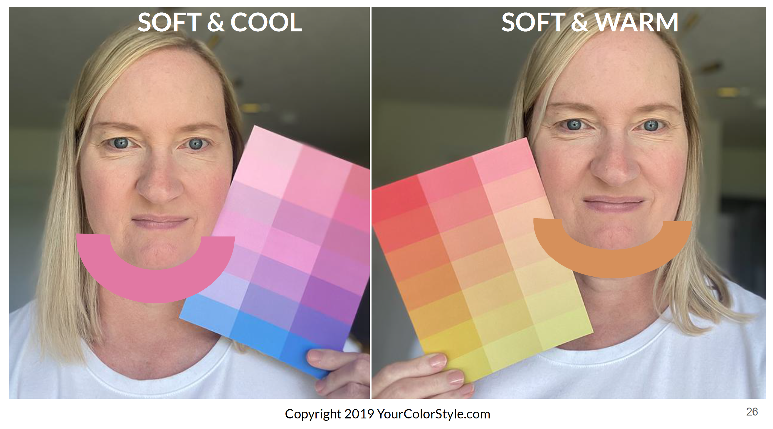
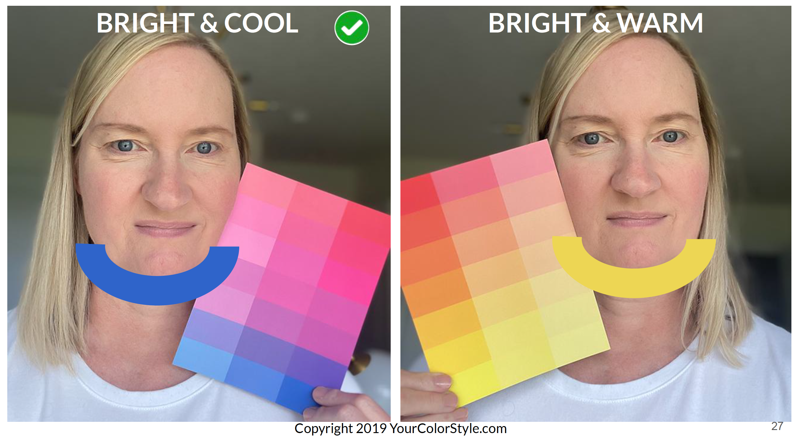
Here are screenshots from a couple of pages from my Color Analysis eBook that shows a comparison of the color categories when I took the photos of the color cards next to my face. These are just a few of the colors cards: Soft & Cool, Soft & Warm, Bright & Cool and Bright & Warm. I’m definitely not in the “warm” category as those colors wash me out. The “Soft & Cool” color card looks ok on me, but the “Bright & Cool” color card made my skin glow! Jen checked the “Bright & Cool” color card since it complements my skin tone the best!
I also had the Professional Color Analysis done, so I could find out the entire process before I shared my experience with you all! I also ordered the Color Fan so I can take it with me when I go shopping, that way I know what colors to shop for. The Color Fan is also handy to use when shopping online! I received my Color Fan in the mail a few days before I started shopping the Nordstrom Anniversary Sale, so I could hold any of the colors in the fan up to my computer screen on any of the clothes to see if I could wear the colors. It was EASY to shop online using my color fan!
My Color Category
When I did the Color Analysis Quiz, it told me I am in the “Bright, Cool & Light” category. Then, when I received the results from Jen and her team from the Professional Color Analysis via the color analysis custom-made eBook, Jen also determined I was in the “Bright, Cool & Light” category!
Although Jen recommends what colors you need to wear, she says in a video on her site that you are not bound to wear those colors in your palette. My color analysis determined that “Light Navy” is one of the deep tones for me. While I enjoy wearing navy, I prefer wearing “Black” better as a base color in my capsule wardrobes. From my color analysis, I have learned that I need to avoid black next to my face, so I will be more mindful of having space between my face and what I wear on the top half of my body.
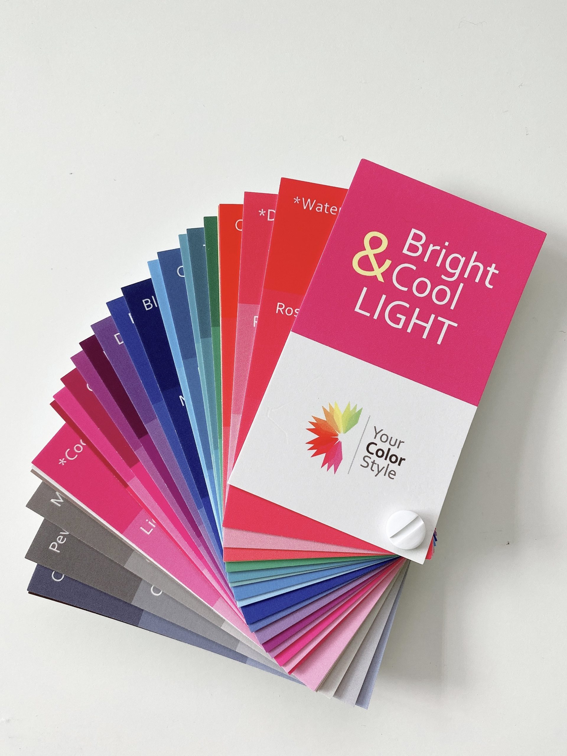
Here is my Color Fan I ordered for my color category, “Bright, Cool & Light”. I can take this color fan with me when I go shopping or I can use it when shopping online to match my color palette to clothes I am consider buying to make sure they will look great on me!
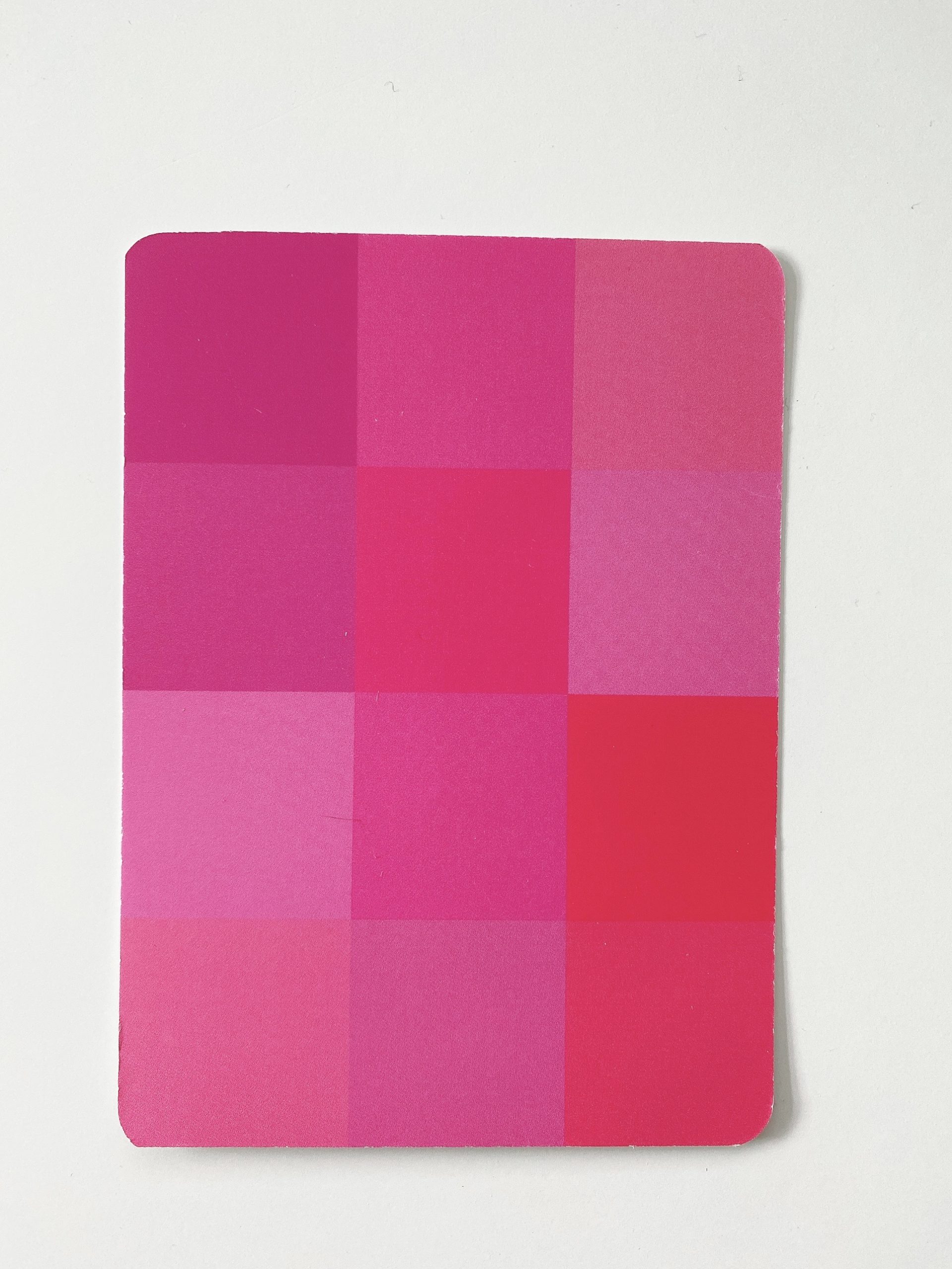
I also ordered the Blushing – Bright & Cool color card. This card, as well as other cards available in the other color categories, help you pick out your best blush and lipstick color when shopping for makeup!
Why I Highly Recommend A Color Analysis
Now that I have had a color analysis done, I can clearly see the benefits of knowing your best colors. Here are just a few benefits of a color analysis…
- Know which colors are flattering on you so you will look radiant in everything you wear.
- No more wasted money on clothes that don’t work for you.
- Feel confident that the colors you wear will let you look your best!
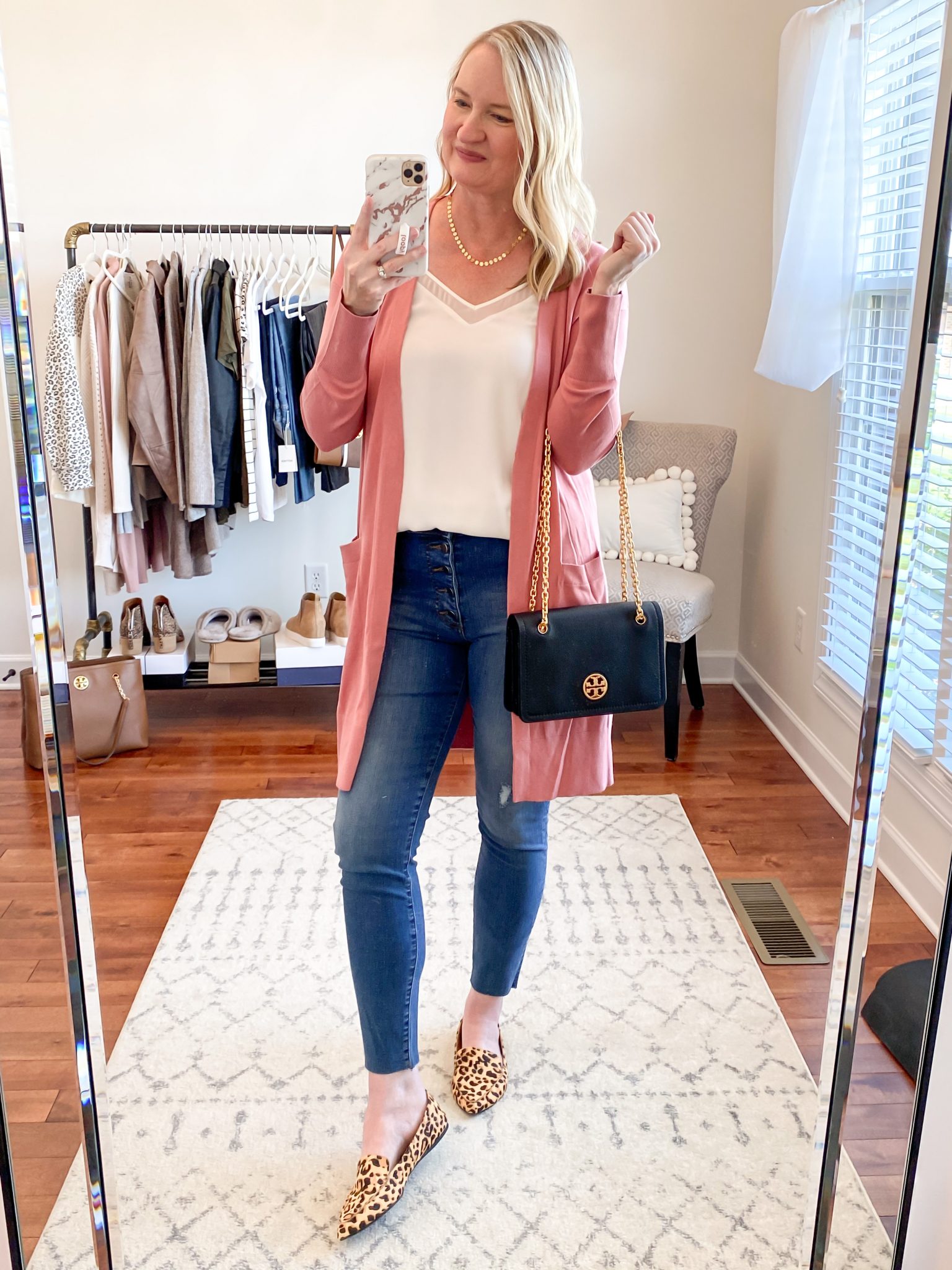
Before I had my color analysis done, I wore colors that I liked rather than ones that looked best on me. I have always loved the color blush pink and have enjoyed wearing it, but looking back last year’s blog post of the “Nordstrom 2020 Anniversary Sale Try-On Session“, I can see clearly how the berry color cardigan (on the right) looks better on me than the soft pink color one (on the left).
Why I Recommend Your Color Style
Jen with Your Color Style has an easy-to-understand approach to color analysis. Instead of being categorized into 1 of 4 “Seasons” (Spring, Summer, Fall or Winter), which is sometimes difficult to determine, Color Categories is a clear way of knowing what type of color type you are. When I would go to color analysis sites, I would look at their Season graphics and try to determine what “season” I was. I didn’t know if I was a “Spring” or “Summer” because the color tones were similar. Your Color Style is a new and fresh approach to determine your color category, which is much easier to understand!
A Color Analysis Also Works With Neutrals!
When you have a color analysis done, you typically you will only find out what COLORS look best on you and we don’t think about neutral tones. Neutrals include black, navy, camel, beige, gray, white and ivory, just to name a few. Neutrals are the classic and timeless colors of our basic essentials that we use in capsule wardrobes. When we use neutral clothes and shoes in our capsule wardrobes, those pieces can easily mix and match creating many outfits.
Do you know what color tones look best on you? By having my color analysis done, I know what neutrals will look best one me. I can wear navy, which I do sometimes, but I enjoy wearing black more. I only include a few black pieces in my capsule wardrobes, and tend to focus more on lighter colors. I know now to avoid wearing black next to my face, so it doesn’t wash me out. Now I know that I need to wear light and medium tone grays and avoid dark tones. I also know to avoid wearing camel, but instead wear a cool beige. All this is helpful to me so I will know I can now look my very best!
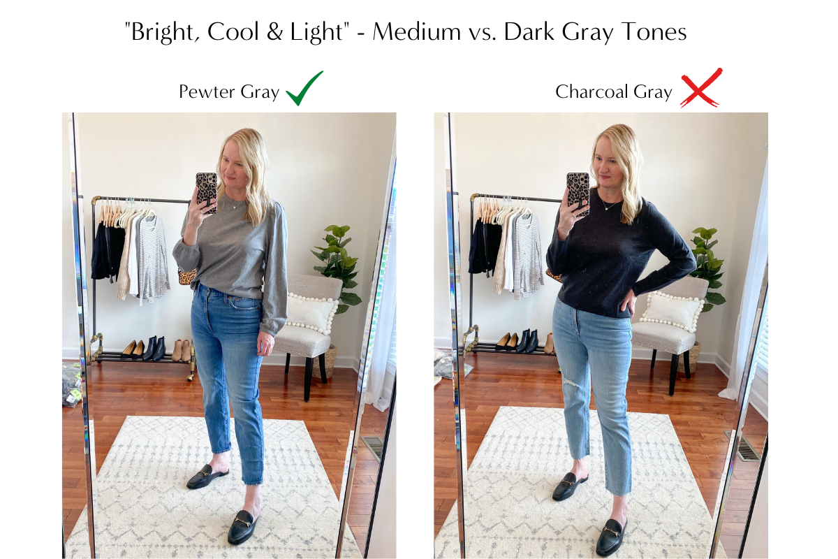
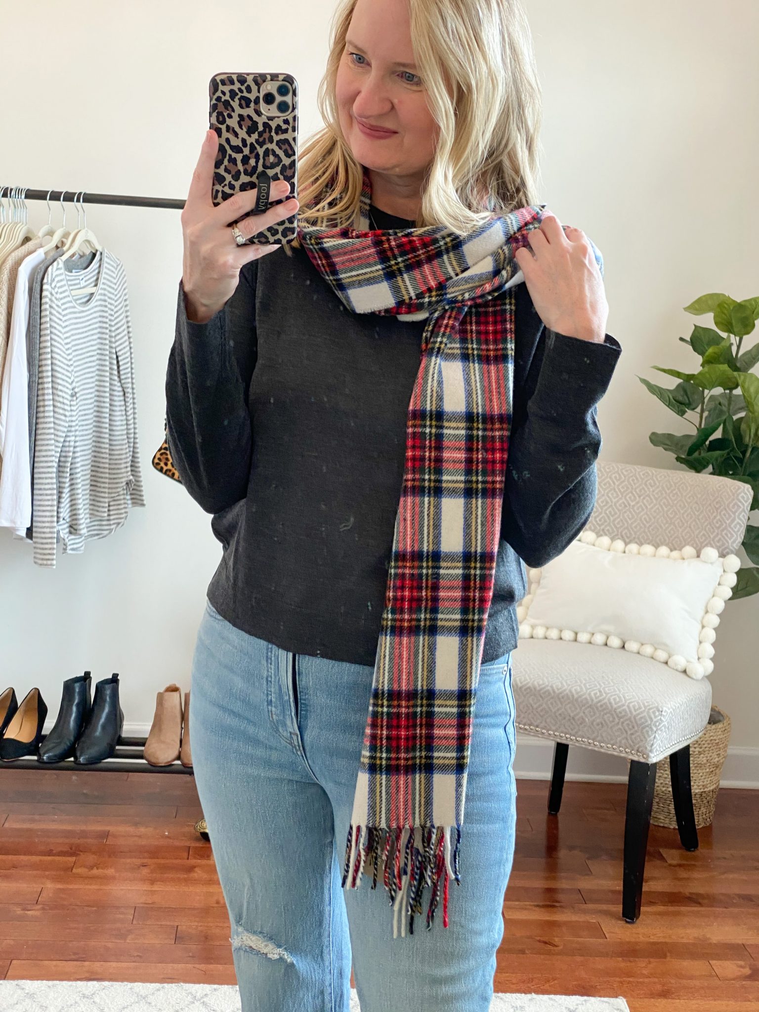
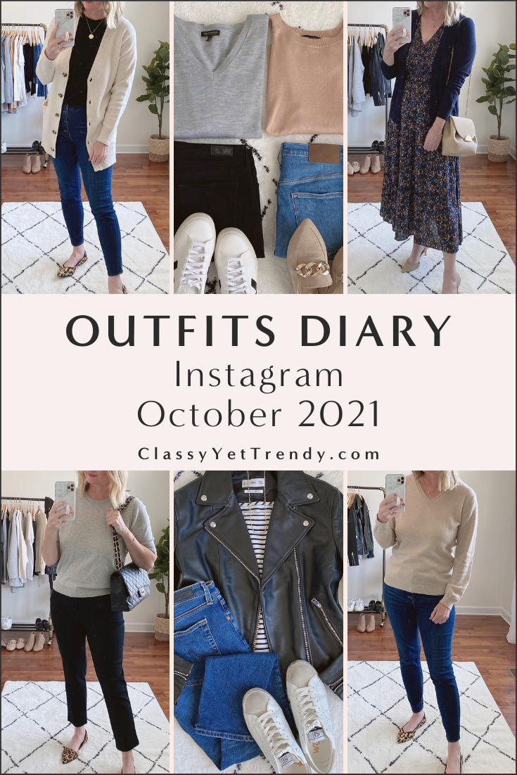
For example, here are a couple of photos from the Try-On Sessions here on the blog where I am wearing a medium tone gray color in my color analysis color palette and a dark gray color which is NOT in my color palette. The medium gray suits my complexion, whereas the dark gray color does not. See the photo on down below of me wearing the dark gray sweater, but add a scarf to break up the dark gray color.
What I Learned From My Color Analysis
I’m SO GLAD I had a Professional Color Analysis done! I discovered many things I need to do and don’t need to do when it comes to wearing both Neutrals AND Colors! The following are discoveries about ME and they may not apply to you. But, if you have a color analysis done, whether it is the Color Analysis Quiz, the DIY Color Style Kit or Professional Color Analysis, chances are you will make new discoveries how colors and tones look on you!
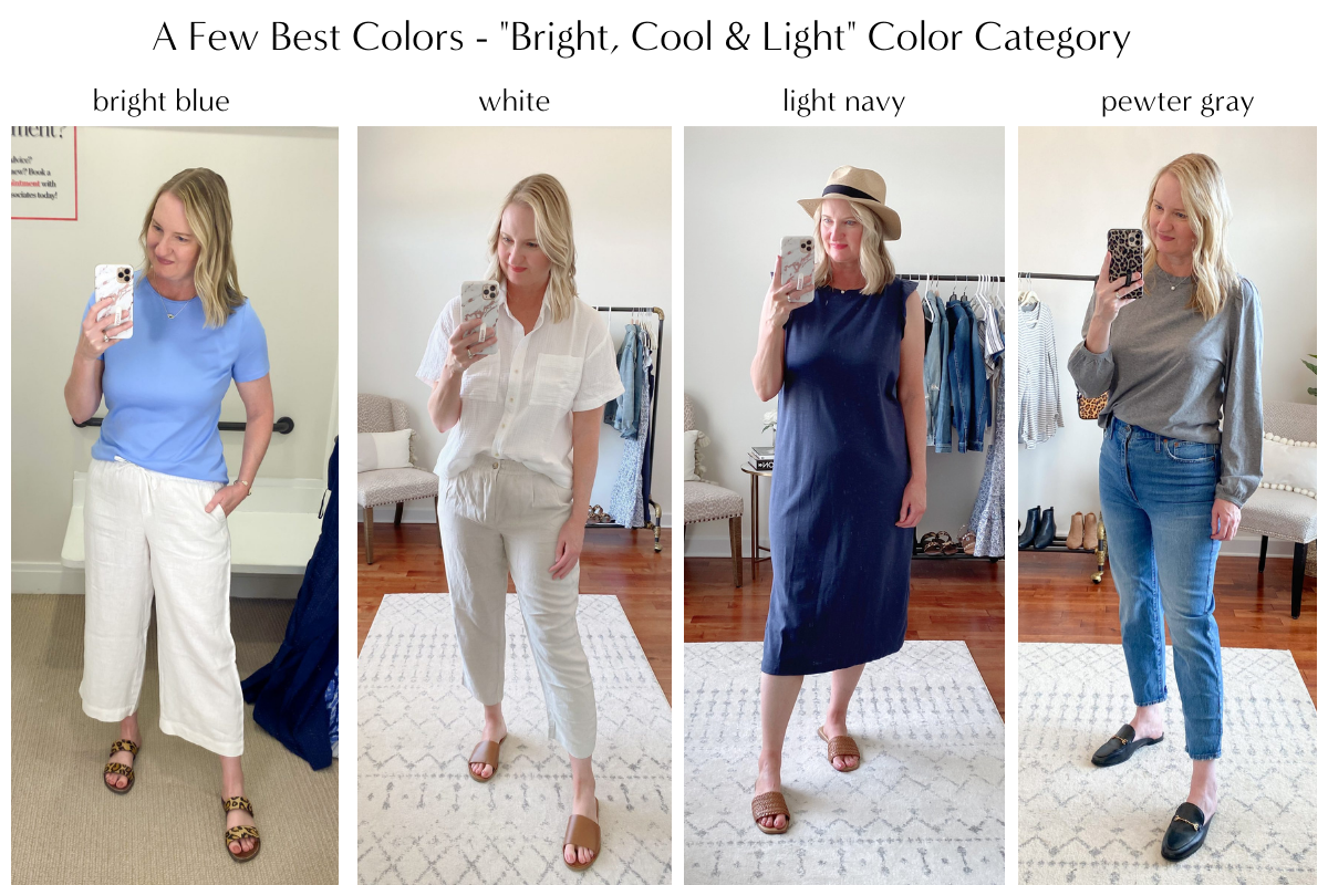
I looked back from a few Try-On Sessions here on the blog and found a few pictures of me wearing colors in my color analysis color palette, which looked complimented my complexion…
And, I found a few photos in the Try-On Sessions here on the blog where the colors I am wearing are not recommended for the “Bright, Cool & Light” category…
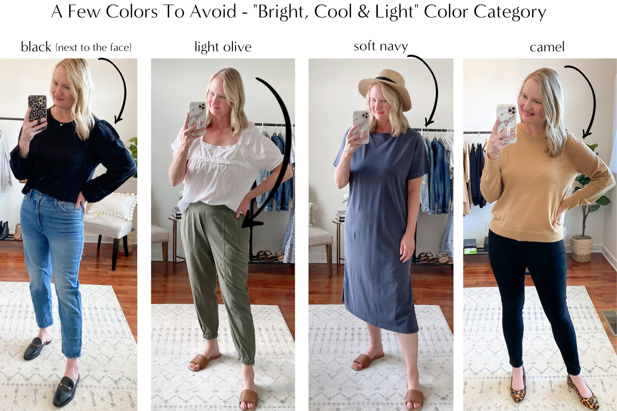
- I need to avoid wearing black next to my face, so I will be more mindful of having space between my face and what I wear. I always thought I needed to avoid wearing it next to my face, seeing the color palette of the deep tones I can wear, confirmed that thought. I tried on a few black tops in my closet and paid close attention to how the color affects my skin tone. If I wear black tops, they need to be a scoop neck, v-neck or open neck style and I need to avoid crewneck style in black tops. I saw that showing more skin on my upper chest area puts more “space” between my face and my top, so that it doesn’t make me look pale. Of course, black bottoms, like jeans, pants, shorts, etc. are ok for me to wear.
- I can wear light to medium Grays. I need to avoid wearing charcoal gray because the color is too dark for my complexion. I have a light gray sweater that I enjoy wearing and now I know it is one of my complementing colors!
- I need to avoid wearing any Warm Tones, like Camel, Goldenrod, Mustard or light Olive. I enjoy wearing Olive, but I do know to wear certain tones of Olive because yellow-toned Olives wash me out.
- Avoid Soft Colors, like soft and light pinks, blues and yellows.
- I need to wear Cool Tones, like cool beiges, bright pinks, berries, greens, blues, purples and yellows, taupes, navy, grays and browns.
- I can SAVE MONEY in the future by buying the best colors for me. No more wasted money on clothes with colors that I like vs. the clothes with colors which look best on me.
Here in the blog post, “Straight Leg Jeans Review + J. Crew & Madewell Dressing Room Try-On Session“, I am wearing a charcoal gray sweater, but the bright colors in the scarf breaks up the deep toned gray and keeps me from looking washed out, so you can wear colors not in your color analysis color palette, but it’s how you wear those colors that determines how you look the best.
How Your Color Style Works With The Capsule Wardrobe eBooks
If you use Simplified Style®: The Dressy & Casual Collection or Simplified Style®: The Athleisure Collection, you can use any of the Your Color Style color analysis to expand those capsule wardrobes by adding clothes with colors, for even more outfits! The Simplified Style® capsule wardrobe collections include clothes and shoes in all neutral colors. Both Simplified Style® eBooks show you, in the last chapter, how to expand your capsule to include colors, so knowing your best colors will help you add a color palette to these capsules!
If you use the Capsule Wardrobe Season Series (Teacher, Essential, French Minimalist, Stay At Home Mom, Athleisure and Workwear), you can substitute the clothes/shoes in the color palette that comes in the capsule with your best colors. So, for example the color palette of one of the eBooks includes camel, a light blue and a light pink in the color palette, you can use clothes with your best colors instead! Instead of the camel, you could use a cool or soft beige; instead of the light blue, you could use royal blue; and, instead of a light pink, you could use magenta. Once again, these color substitutions are just examples, so feel free to substitute any of your best colors.
I hope this helps if you are wanting to do a color analysis to find out your best colors! Remember, you can choose to do the free Color Analysis Quiz, the budget-friendly DIY Color Style Kit or full Professional Color Analysis (I did this one and was very pleased with the results), Chances are, you will make discover how colors and tones look on you and you will enjoy wear color in your outfits!
A Bit Of Inspiration For Your Day:
“But I will sing of your strength, in the morning I will sing of your love; for you are my fortress, my refuge in times of trouble.” – Psalms 59:16


Thanks for sharing this! I had an analysis with Jen several years ago; I am a soft, cool and deep type. Her system is really great! I’ll have to go revisit all my materials and maybe order a fan. Thx!
That’s great to hear you had a color analysis done with Your Color Style! Thank you for sharing.
What a great post . Thx
Jen’s group did my colors too. I’m bright, warm, medium and basically look best in the colors you don’t look good in, lol. In the future maybe you would consider offering your capsules in a warm option so we warms don’t have to find all the items on our own?
This was a great post! How does chambray fit into your colors? ?
I had been trying to analyse my colours DIY style for years (with the help of the facebook group Figure My Season) before I won a competition to have a free customised analysis and personal palette by Heather Noakes last year (https://heathern.co/). It was amazing and my colouring was determined as a soft summer (leaning warm and slightly deep).
As it turns out my skin and hair are so neutral that she had difficulty determining between Soft Summer and Soft Autumn on me. It was close but she eventually decided that I tip just fractionally closer to soft summer. Like you I shouldn’t really wear black near my face (although I do occasionally) and navy or charcoal are better as base colours. The custom fabric palette makes it easy to find my best colours when out shopping, so well worth it for anyone who is interested.
If you ever get the time/chance it would be fun to see you create a capsule for each of the main 12 color seasons. (I know it would be a big job, as I considered doing it myself, but found it really tricky). Maybe mini 10 item capsules would be a fun way to test it out.
I had my colors done professionally three years ago and it has made such a difference. People ask what I’m doing because they say I look younger! I was wearing way too much black. All of the capsules work when I just adjust by substituting MY colors.
I color analyzed people years ago to help them with makeup purchases. One thing I learned is that there are things you can do if a favorite color isn’t in your palette. I do feel it’s best to stick with your warm or cool colors because the wrong tone can wash you out pretty quickly. But if you just want to go darker in your cool or warm color family, you can trick your eye by using makeup to darken your brows. I use a brow gel mascara that looks very natural but darkens my brows several shades and allows me to carry off those darker tones.
Just curious what does cool beige look like?
Leanne, you radiate in your new colors! Thank you for sharing Your Color Style! I took the quiz which seemed to solve my waffling between “season!” I ordered the color fan, too!
I love your blog of ideas for capsule wardrobes and your Bits of Inspiration! Thanks!
I can’t wait to see your upcoming capsules taking all those beautiful colors (especially jewel tones) and the right neutrals into account! My mom had her colors done 40 years ago and confirmed almost everything you said about black next to your face, no camel, mustard, etc. when I was growing up and we shopped together. I’m even more excited to continue following your blog! ????
I think you personally look best in warm colors! The warm beiges, oatmeals, warm browns look amazing on you and make your eyes pop in a dynamic way! Just my thoughts though! Good luck on your journey! Have you heard of Carol Tuttle’s system?
I was just about to ask about Carol Tuttle’s system. Personally, I think that system does not account for warm and cool very well (I am a cool) but I got a lot out of the concepts and what other aspects of clothing to consider. It took a lot of diving into the details and the paid portion of the site for me to really understand it. The quick quiz just left me feeling quite ungrounded (I am a T1/S4). I really needed to understand how my secondary was exhibited and not just look at my primary.
Hi Leanne,
I love your post so much. I’ve been redoing my wardrobe from the encouragement you have shown me in your capsule the two I purchased. I am a summer and have been redoing my wardrobe according to my colors. Thank you for all your great ideas!
I can’t wait to see the fall capsules.